Alignment Positions
Published by @SoNiceInfo at 6/24/2020
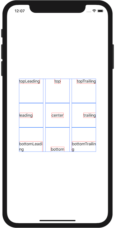
You can define 9 positions with Alignment.
This is a figure showing the alignments.
To show alighment positions, letters are framed with red, frames are colored with blue using VStack and HStack.
Aligment is specified like VStack(alignment: .leading) and frame(alignment: .top).
Once you learn Top, Bottom, Leading and Trailing, you can use it intuitively.
| topLeading | top | topTrailing |
|---|---|---|
| leading | center | trailing |
| bottomLeading | bottom | bottomTrailing |
//
//  ContentView.swift
//

import SwiftUI

struct ContentView: View {
    var body: some View {
        VStack() {
            HStack() {
                Text("topLeading")
                    .border(Color.red)
                    .frame(width: 100, height: 100, alignment: .topLeading)
                    .border(Color.blue)
                Text("top")
                    .border(Color.red)
                    .frame(width: 100, height: 100, alignment: .top)
                    .border(Color.blue)
                Text("topTrailing")
                    .border(Color.red)
                    .frame(width: 100, height: 100, alignment: .topTrailing)
                    .border(Color.blue)
            }
            HStack() {
                Text("leading")
                    .border(Color.red)
                    .frame(width: 100, height: 100, alignment: .leading)
                    .border(Color.blue)
                Text("center")
                    .border(Color.red)
                    .frame(width: 100, height: 100, alignment: .center)
                    .border(Color.blue)
                Text("trailing")
                    .border(Color.red)
                    .frame(width: 100, height: 100, alignment: .trailing)
                    .border(Color.blue)
            }
            HStack() {
                Text("bottomLeading")
                    .border(Color.red)
                    .frame(width: 100, height: 100, alignment: .bottomLeading)
                    .border(Color.blue)
                Text("bottom")
                    .border(Color.red)
                    .frame(width: 100, height: 100, alignment: .bottom)
                    .border(Color.blue)
                Text("bottomTrailing")
                    .border(Color.red)
                    .frame(width: 100, height: 100, alignment: .bottomTrailing)
                    .border(Color.blue)
            }
        }.border(Color.blue)
    }
}

struct ContentView_Previews: PreviewProvider {
    static var previews: some View {
        ContentView()
    }
}
