Create iPod classic UI
Published by @SoNiceInfo at 6/24/2020
Not long ago, an iPod classic-style music playback application was talked about, but it was removed from the App Store and is no longer available.
So, I decided to create a new UI in SwiftUI, so I'm going to reproduce the UI of iPod classic.
The goal
The reproduction is iPod 5th that I used to use as well.
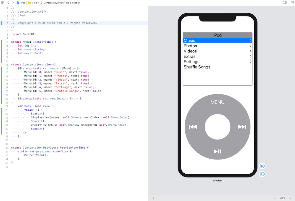
And here's the goal to recreate this time. (The implementation of the music playback function is yet to be determined.) Of course, I also reproduce the pleasant click sound when you spin the click wheel.
- White iPod in light mode, Black iPod in dark mode
- Reproduce the display and click wheel
- Change the selection on the display in conjunction with the click wheel
Products
Products of this page are below.
Create white and black iPod
The 5th generation iPod classic was available in white and black, so I'll have two colors.
Implements a white iPod in light mode and a black iPod in dark mode.
Creating color sets for light and dark modes
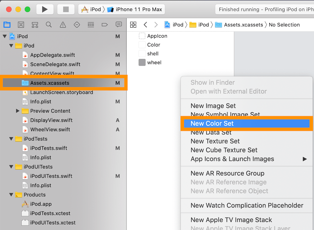
Make an original color set in Assets.xassets to support light, dark mode.
To create one, in Assets.xassets, rihgt click below AppIcon, select New Color Set. 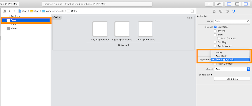
Chnage Appearances to Any, Light, Dark in the inspect pain (right pain).
Creating the body and wheel color
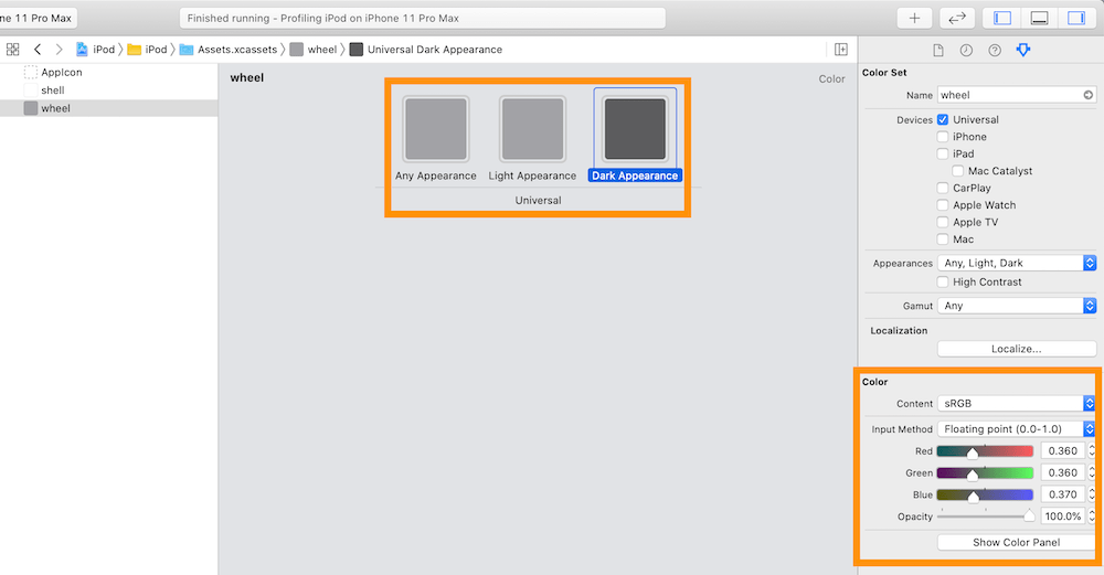
Select Any Appearance, Light Appearance, and Dark Appearance in the center of the screen and create a color in the Color of the aspect pane (right side pane).
The body color is white for Any Appearance and Light Appearance and black for Dark Appearance.
The color of the wheel is light gray in Any Appearance and Light Appearance and dark gray in Dark Appearance.
Use the colors you create
Use Color("") to use colors created in Assets.xassets.
In this case, Color("shell"), Color("wheel").
Creating structs - ContentView
Creating a menu
The menu shall be an Identifiable Protocol-compliant structure with id(Int type), name(String type), next(Bool type, with or without next item).
The properties may be different as we build in for the next menu display, but once we do this
Prepare menuIndex variable so that you can control what item is selected in the menu.
By wrapping a variable in @State, the SwiftUI is responsible for notifying the view when there is a change.
//
//  ContentView.swift
//

import SwiftUI

struct Menu: Identifiable {
    let id: Int
    let name: String
    let next: Bool
}

struct ContentView: View {
    @State private var menus: [Menu] = [
        Menu(id: 0, name: "Music", next: true),
        Menu(id: 1, name: "Photos", next: true),
        Menu(id: 2, name: "Videos", next: true),
        Menu(id: 3, name: "Extras", next: true),
        Menu(id: 4, name: "Settings", next: true),
        Menu(id: 5, name: "Shuffle Songs", next: false)
    ]
    @State private var menuIndex : Int = 0

    var body: some View {
        VStack () {
            Spacer()
            DisplayView(menus: self.$menus, menuIndex: self.$menuIndex)
            Spacer()
            WheelView(menus: self.$menus, menuIndex: self.$menuIndex)
            Spacer()
        }
    }
}

struct ContentView_Previews: PreviewProvider {
    static var previews: some View {
        ContentView()
    }
}
At the moment, we haven't created a DisplayView and WheelView, so we get an error.
Pass menus and menuIndex variables, they are referenced and seen in each views.
Changing menuIndex in the WheelView sends a notification to the DisplayView and changes the menu display.
Creating display - DisplayView
To create a DisplayView, here's a summary of the iPod classic's menu display requirements.
- Corner Radius with Frame
- Gray Title Bar and iPod Title
- List Menu Contents
- Selected Item has white letters and blue background
- Arrow is displayed with next menu
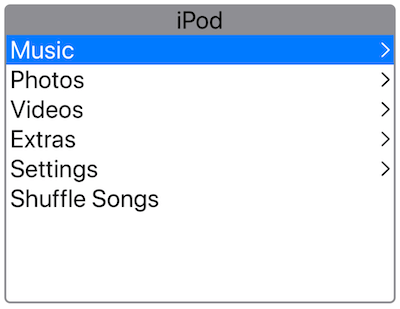
Corner Radius with Frame
GeometryReader { geometry in
    VStack (alignment: .leading, spacing: 0) {
        // To be implemented
    }
    .background(Color.white)
    .frame(width: geometry.size.width * 0.95, height: 300)
    .clipShape(RoundedRectangle(cornerRadius: 5))
    .overlay(RoundedRectangle(cornerRadius: 5).stroke(lineWidth: 2).foregroundColor(Color.gray))
}
The contents of the display will consist of VStack..background() to make the background white..frame() to specify the display size.
Use GeometryReader to get the screen size. Use geometry.size.width to get the width of the screen. so I'll make it about 95% of that. The height is fixed at 300.
There's a bit of a trick to implementing a rounded corner with a frame.
First, we need to create a .clipShape(RoundedRectangle(cornerRadius: 5)) in the shape of a rounded rectangle cutting out the VStack.
Then, apply .overlay(RoundedRectangle(cornerRadius: 5).stroke(lineWidth: 2).foregroundColor(Color.gray)) to overlay the same round-cornered square frame on it.
Gray Title Bar and iPod Title
Text("iPod")
    .font(.system(size: 25))
    .frame(width: geometry.size.width * 0.95, height: 30.0)
    .background(Color.gray)
In this section, I'll implement the part of // To be implemented.
Display iPod with Text at the title bar.
Set font size to 25 with .font().
Set gray background with .background().
Set width with .frame(width: geometry.size.width * 0.95, height: 30.0) to apply background color to entire title bar.
List Menu Contents
ForEach(self.menus) { menu in
    HStack () {
        Text(menu.name)
            .font(.system(size: 25))
        Spacer()
        if (menu.next){
            Image(systemName: "chevron.right")
        }
    }
    .padding(.horizontal, 5)
    .foregroundColor(menu.id == self.menuIndex ? .white : .black)
    .background(menu.id == self.menuIndex ? Color.blue : Color.white)
}
Implement the contents of the menu.menus variable is provided from ContentView, Use ForEach(menus) { menu in ... } to display menu one by one.
With HStack, display arrow when it has next content.
Selected Item has white letters and blue background
Set color with menu.id == self.menuIndex thus, if the menu is selected.
Set letter color with .foregroundColor(menu.id == self.menuIndex ? .white : .black).
Set background color with .background(menu.id == self.menuIndex ? Color.blue : Color.white).
Arrow is displayed with next menu
Display Image(systemName: "chevron.right") if menu.next is true.
SF Symbols are used for display right arrow.
Please see Display SF Symbols for more detail about SF Symobls.
Complete DisplayView
//
//  DisplayView.swift
//

import SwiftUI

struct DisplayView: View {
    @Binding var menus: [Menu]
    @Binding var menuIndex: Int

    var body: some View {
        GeometryReader { geometry in
            VStack (alignment: .leading, spacing: 0) {
                Text("iPod")
                    .font(.system(size: 25))
                    .frame(width: geometry.size.width * 0.95, height: 30.0)
                    .background(Color.gray)
                ForEach(self.menus) { menu in
                    HStack () {
                        Text(menu.name)
                            .font(.system(size: 25))
                        Spacer()
                        if (menu.next){
                            Image(systemName: "chevron.right")
                        }
                    }
                    .padding(.horizontal, 5)
                    .foregroundColor(menu.id == self.menuIndex ? .white : .black)
                    .background(menu.id == self.menuIndex ? Color.blue : Color.white)
                }
                Spacer()
            }
            .background(Color.white)
            .frame(width: geometry.size.width * 0.95, height: 300)
            .clipShape(RoundedRectangle(cornerRadius: 5))
            .overlay(RoundedRectangle(cornerRadius: 5).stroke(lineWidth: 2).foregroundColor(Color.gray))
        }
    }
}

struct DisplayView_Previews: PreviewProvider {
    @State static var menus: [Menu] = [
        Menu(id: 0, name: "Music", next: true),
        Menu(id: 1, name: "Photos", next: true),
    ]

    @State static var menuIndex : Int = 0

    static var previews: some View {
        DisplayView(menus: $menus, menuIndex: $menuIndex)
    }
}
Creating Click Wheel - WheelView
Here's a summary of the requirements for the click wheel.
- Double Round Structure of Wheel and Button
- Up, Down, Left and Right MENU and Play Buttons
- Click the Center to Go to Next Menu (tap only here)
- Move up and down by Spinning the Wheel
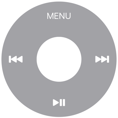
Double Round Structure of Wheel and Button
GeometryReader { geometry in
    Circle()
    .frame(width: geometry.size.width * 0.9, height: geometry.size.width * 0.9)
    .foregroundColor(Color("wheel"))
    .overlay(
        Circle()
            .frame(width: geometry.size.width * 0.35, height: geometry.size.width * 0.35)
            .foregroundColor(Color("shell"))
})
First, create a circle of 90% of the screen width, which become a Wheel.
Next, overlay() a new circle of 35% of the screen width, which become a center button. For colors, we use our own color set for light and dark modes.
Now we have a click wheel, which has a double round structure with a wheel and a tap part.
Up, Down, Left and Right MENU and Play Buttons
GeometryReader { geometry in
    ZStack () {
        Circle()
            .frame(width: geometry.size.width * 0.9, height: geometry.size.width * 0.9)
            .foregroundColor(Color("wheel"))
            )
            .overlay(
                Circle()
                    .frame(width: geometry.size.width * 0.35, height: geometry.size.width * 0.35)
                    .foregroundColor(Color("shell"))
            )
        Text("MENU")
            .font(.title)
            .foregroundColor(.white)
            .offset(y: -140)
        Image(systemName: "playpause.fill")
            .font(.title)
            .foregroundColor(.white)
            .offset(y: 140)
        Image(systemName: "forward.end.alt.fill")
            .font(.title)
            .foregroundColor(.white)
            .offset(x: 140)
        Image(systemName: "backward.end.alt.fill")
            .font(.title)
            .foregroundColor(.white)
            .offset(x: -140)
    }
}
Put the click wheel into ZStack and put the MENU, play button, etc. on it.
Use Text for MENU, SF Symbols for playback buttons, etc.
Use offset to shift them on the click wheel.
Click the Center to Go to Next Menu (tap only here)
import AVFoundation

..snip..

Circle()
    .frame(width: geometry.size.width * 0.35, height: geometry.size.width * 0.35)
    .foregroundColor(Color("shell"))
    .gesture(
        TapGesture(count: 1)
            .onEnded {
                AudioServicesPlaySystemSound (1104)
                print("Tapped")
            }
    )
Implement the "Tap" of the click wheel.
This time, our goal is to reproduce the UI of iPod classic, so we'll go so far as to "make it possible to take an action when tapped".
Use .gesture() and TapGesture() to make center button making some actions.
Count in TapGesture(count: 1) means "make actions when user tapped the count".
With .onEnded, set actions when tapping ended.
This time, we're just going to show it as "Tapped" on Xcode.
It makes a click sound using the system sound provided by Apple by default.
Import AVFoundation and then call AudioServicesPlaySystemSound().
I used this repository as a reference for myself.TUNER88/iOSSystemSoundsLibrary: List of all system sounds used in iOS
Move up and down by Spinning the Wheel
import AVFoundation

..snip..

@State private var lastAngle: CGFloat = 0
@State private var counter: CGFloat = 0

..snip..

Circle()
    .frame(width: geometry.size.width * 0.9, height: geometry.size.width * 0.9)
    .foregroundColor(Color("wheel"))
    .gesture(DragGesture()
        .onChanged{ v in
            // Calc rotation angle
            var angle = atan2(v.location.x - geometry.size.width * 0.9 / 2, geometry.size.width * 0.9 / 2 - v.location.y) * 180 / .pi
            if (angle < 0) { angle += 360 }
            // Calc diff of rotation angle as theta
            let theta = self.lastAngle - angle
            self.lastAngle = angle
            // add theta
            if (abs(theta) < 20) {
                self.counter += theta
            }
            // Move menu cursor when the counter become more(less) 20.
            if (self.counter > 20 && self.menuIndex > 0) {
                self.menuIndex -= 1
                AudioServicesPlaySystemSound (1104)
            } else if (self.counter < -20 && self.menuIndex < self.menus.count - 1) {
                self.menuIndex += 1
                AudioServicesPlaySystemSound (1104)
            }
            if (abs(self.counter) > 20) { self.counter = 0 }
        }
        .onEnded { v in
            self.counter = 0
        }
    )
When you turn the wheel part, the menu item will change.
The general flow is: "Calculate rotation angle for the amount of rotation", "Calculate the difference from the previous rotation", "Build up the rotation angle only if the differential rotation angle is small", "When the rotation angle is 20, move the menu down; when it is -20, move it up".
Please see Rotate with DragGesture for more detail about rotation angle.
The reason for the "build up only if the differential rotation angle is small" is to prevent the menu from moving abnormally when the rotation angle straddles between 0 and 360 degrees.
When counter reaches 20 (-20), move the menuIndex by 1 (-1) to change the selection.
Sound with AudioServicesPlaySystemSound (1104) by menuIndex changed. When you're done with the spinning gesture, set the value of counter back to 0.
The final WheelView
//
//  WheelView.swift
//

import SwiftUI
import AVFoundation

struct WheelView: View {
    @Binding var menus: [Menu]
    @Binding var menuIndex: Int
    @State private var lastAngle: CGFloat = 0
    @State private var counter: CGFloat = 0

    var body: some View {
        GeometryReader { geometry in
            ZStack () {
                Circle()
                    .frame(width: geometry.size.width * 0.9, height: geometry.size.width * 0.9)
                    .foregroundColor(Color("wheel"))
                    .gesture(DragGesture()
                        .onChanged{ v in
                            // 回転角を計算する
                            var angle = atan2(v.location.x - geometry.size.width * 0.9 / 2, geometry.size.width * 0.9 / 2 - v.location.y) * 180 / .pi
                            if (angle < 0) { angle += 360 }
                            // 回転差分を計算する
                            let theta = self.lastAngle - angle
                            self.lastAngle = angle
                            // 少ない回転角のものを積み上げていく
                            if (abs(theta) < 20) {
                                self.counter += theta
                            }
                            // counterが20以上(以下)になったらメニューを移動
                            if (self.counter > 20 && self.menuIndex > 0) {
                                self.menuIndex -= 1
                                AudioServicesPlaySystemSound (1104)
                            } else if (self.counter < -20 && self.menuIndex < self.menus.count - 1) {
                                self.menuIndex += 1
                                AudioServicesPlaySystemSound (1104)
                            }
                            if (abs(self.counter) > 20) { self.counter = 0 }
                        }
                        .onEnded { v in
                            self.counter = 0
                        }
                    )
                    .overlay(
                        Circle()
                            .frame(width: geometry.size.width * 0.35, height: geometry.size.width * 0.35)
                            .foregroundColor(Color("shell"))
                            .gesture(
                                TapGesture(count: 1)
                                    .onEnded {
                                        AudioServicesPlaySystemSound (1104)
                                        print("Tapped")
                                    }
                            )
                    )
                Text("MENU")
                    .font(.title)
                    .foregroundColor(.white)
                    .offset(y: -140)
                Image(systemName: "playpause.fill")
                    .font(.title)
                    .foregroundColor(.white)
                    .offset(y: 140)
                Image(systemName: "forward.end.alt.fill")
                    .font(.title)
                    .foregroundColor(.white)
                    .offset(x: 140)
                Image(systemName: "backward.end.alt.fill")
                    .font(.title)
                    .foregroundColor(.white)
                    .offset(x: -140)
            }
        }
    }
}

struct WheelView_Previews: PreviewProvider {

    @State static var menus: [Menu] = [
        Menu(id: 0, name: "Music", next: true),
        Menu(id: 1, name: "Photos", next: true),
    ]

    @State static var menuIndex : Int = 0

    static var previews: some View {
        WheelView(menus: $menus, menuIndex: $menuIndex)
    }
}
Conclusion
There are three components: ContentView, DisplayView, and WheelView.
Please see and play with the code on GitHub(https://github.com/d1v1b/iPodClassicUI).
